Know the Oil Pastel Media!

Today, I would like to talk about my favorite working tool, the 'oil pastel', which many people are curious about. Through this blog, I will share the know-how and unique experiences I have gained while working with oil pastels!
What exactly is an oil pastel?
Oil pastels are solid painting tools made by mixing wax and oil (such as palm oil) and solidifying them into a stick form. You might think of the 'crayons' you used in childhood; however, oil pastels contain a higher oil content and are much softer, more pliable, and have a creamy texture that applies matte. Unlike regular soft pastels, which produce powdery residue, oil pastels have a clay-like consistency that adheres closely to paper. This allows for the heavy texture characteristic of oil painting to be achieved without a brush, using only pressure and body heat to apply color. They are a medium where the artist's energy is recorded most honestly on the paper.
The reason I find 'oil pastels' to be an attractive and enjoyable medium is that it is a tool that doesn't have to be perfect. Even if it gets a bit clumpy or goes outside the lines, it creates its own texture and becomes a wonderful accident! Rather than focusing on precision, I recommend this medium for those who want to feel the warm power of color and the energy of contrast that oil pastels provide!
"My Color Tools: BrandStar The Unique Charm of Oil Pastels"
Oil pastels vary in greasiness and pigment density depending on the brand. Here, I will introduce the characteristics of 5 to 6 brands that I have personally used in my studio.
Munqyo - Artist Soft Oil Pastels
"Strongest fundamentals, a starting point for everyone"

Mungyo oil pastels offer overwhelming value for money, yet their performance is comparable to professional-grade products. They possess a suitable balance of hardness and softness, making them widely used by everyone from beginners to experienced artists.

I would like to recommend this Mungyo oil pastel to those who are trying oil pastels for the first time. When I started, I also used this Mungyo product in a set of 120 colors. The reason is that it was the most affordable among oil pastels, and it offers good quality with a smooth texture, blends well between colors, and layers nicely. It was an ideal product for those who want to express themselves with a soft, velvet-like texture. Additionally, purchasing individual colors also provides good value for money.
Carand' Ache - Neopastel
"Refined coloring hidden within firmness"

This pastel embodies the sophistication of Switzerland. It is firmer than Sennelier pastels, yet offers very vivid and luxurious colors. With minimal residue and high density, it excels in "depiction." It is ideal for detailed touches, such as sharp lines in landscapes or the texture of animal fur.

This is the second product I used. While you can use watercolor alone, wet (watercolor) products mix well with water, making it easy to create various colors. However, the colors from dry (pastel) types are limited, so I used it alongside other products. When I used it, I found that Caran d'Ache Neopastel had a firmer texture compared to watercolor, and while some had a creamy feel rather than a velvet one, there were also slightly translucent textures. The colors were more sophisticated than those of watercolor, which I found appealing. Additionally, layering different products together felt richer in terms of shape expression than using only watercolor or Neopastel alone. However, if you are a beginner or new to oil pastels, I recommend trying them individually rather than starting with Neopastel right away. When you want to learn more about oil pastels through painting, it’s better to have a set ready for use.
Sennelier
"The pinnacle of softness, like lipstick touching the lips."

Sennelier oil pastels are a well-known brand created for Pablo Picasso. They have a very high oil content, making them almost akin to 'solid paint.' They possess an overwhelming creaminess, melting like butter without needing much pressure, allowing them to cover the paper effortlessly. When used for impasto (thick layering), they exude an irreplaceable presence.
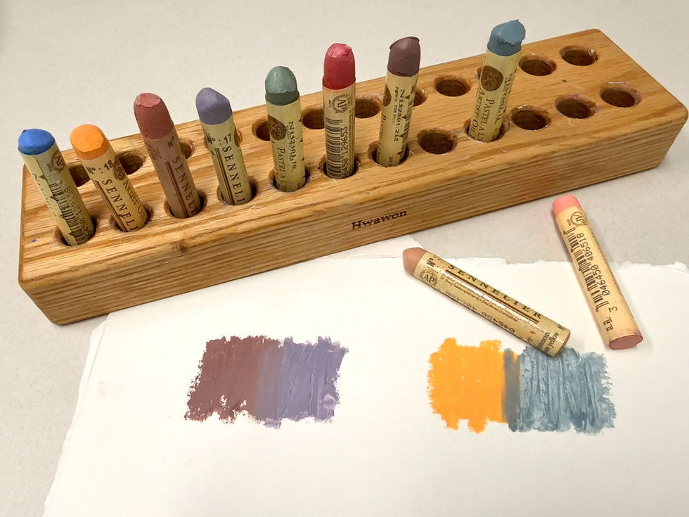
When I first encountered Sennelier oil pastels, I was pleased that they could produce a texture similar to thick oil paints. However, I do not recommend using this product exclusively if you are new to it. This is because when used solely with Sennelier pastels, the high oil content can lead to longer drying times when mixing colors. After a bit of drying, I was able to layer other colors on top. If you want to achieve a texture and color reminiscent of oil paints, you can use Sennelier oil pastels as your main medium. On the other hand, if you are looking for a creamy texture and color similar to opaque velvet, I suggest using brands like Mungyo or Caran d'Ache primarily, and occasionally incorporating Sennelier. Additionally, Sennelier oil pastels can transfer to your hands if you have warm hands, so it's best to store them separately with other Sennelier products. Personally, I tend to use Sennelier oil pastels for transparent effects or to finish with highlights.
Holbein
" Unique delicacy and rich colors of Japan"

It has a smooth application with minimal stickiness, gliding on effortlessly. The texture is very fine, and when blended, it creates a soft, cloud-like feel with rich colors that look great. As mentioned, there are many subtly warm tones. There are a lot of Eastern pastel colors and clear mid-tones that are hard to find in Western markets, making it a go-to choice for painting emotional landscapes or still lifes.

And what I felt was that the products from Mungyo or Caran d'Ache had a medium level of firmness and texture, giving a decayed feeling. Therefore, it seemed more like a creamy category with a velvet feel, similar to Mungyo or Caran d'Ache, rather than Cretacolor. However, I appreciated the abundance of warm-toned colors that were available, aside from Caran d'Ache. These three were also suitable for layering in combination.
Kawachi
"Rare texture, my secret tool"

This is an uncommon brand, known as 'Kawachi Paints,' which is a historic paint manufacturer in Japan. Compared to other brands, it has a unique texture and vintage color palette that makes it appealing. Rather than bright primary colors, it offers more subdued and deep tones, making it ideal for adding depth and a distinctive atmosphere to artworks.
If you want to share tips on using oil pastels by Minne Kim?
- Primarily, I tend to use Mungyo and Caran d'Ache products for the base colors or to establish the overall form. When I want to introduce color variations, I use blending techniques, and for a unique feel, I might add colors from Holbein or Kawai to enhance thickness, texture, and richness of color. Next, I finish the details or points with Cinnelier. Although I sometimes use Cinnelier for highlights, recently I have also used Mungyo products for a matte highlight effect.
If you ask me which pastel is the best, I would say, "If you learn about the process of finding a pastel that suits you well, you will surely make another discovery within that, and it seems that this has also led to creating works." I hope my blog has been helpful to you all.
댓글